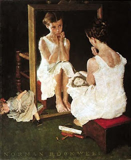
If I can get you to think "inside" the box for a bit...
(For those unfamiliar, you'll find I use a lot of bad jokes, worse puns, mixed messages and typos to keep you on your toes, so don't say I didn't warn you. But I'll work on playing this one pretty straight.)
Sober values—bright or dark, pure or muddy colors. The heaviness or lightness of an object and how much of the painting the object takes up. Line—the hunched spine, the proud up-angle, a triangle created by glow or shadow, the completion of a circle or triangle. Composition. Telling us where to look, when to linger, how we should be thinking about what we are seeing.
There are literally hundreds of decisions that can be made in the construction of a single painting. Decisions made before paint ever touches the canvas. They are not random elements strewn for the sake of a pretty basket or an important newspaper headline. Every element contributes to the whole work. The collection of parts arranged, not only to tell the story, but for the sake of the composition.
A near invisible circle to contain the eye, or an "X"—two diagonals whose purpose is force the eye to a particular moment of importance. In a complex composition where the viewer's attention is made to roam, the area of lightest light placed against the darkest dark will always pull the viewer back. The seemingly casual insertion of a child's doll may be placed in a way that pulls the eye into the composition like a river into a landscape.
The strategic use of negative space—one of the most important elements to any composition is a non-element. The eye needs a place to rest or we experience the uneasiness of claustrophobia. We will tire of the experience.
A large empty space on an otherwise cluttered wall helping to lift the mood of the viewer. Or a thin vertical element falling from that clutter, completing a square, containing the moment of importance and forbidding the eye to follow that corner clutter up off the painting.
Balance. The straight back of uncertainty mirroring the stiff lines of a wooden chair. All heads turned in his direction, eyes leveled like the horizontal lines of the flag. An otherwise casual human landscape, overcoat thrown into the foreground, the leaning chair-back to one side, dark object (umbrella) to the other, a solid ovoid working to contain the horizontal movement of the eye.
The obvious strength of a solid dark vertical. A more subservient "S" that might lead the viewer astray is thwarted by a near-perfect circle formed by the pose of the arms, and yes, even the sandwich pointing to the expression the artist wants us to share.
Somber colors, heavy with intent. A single white shirt for purity's sake. A tight circle of bowed heads within a rectangle (as circles tend to relax us overmuch) and a larger circle, figures cropped around the periphery for just such a purpose. Perhaps a touch of tableware, even knife handles pointing in to our moment of earnest.
A circle of joy overwhelming a subject.
Or raw, obvious emotion.
These, and many more, are the master artist's magic act, a slight-of-hand you may not recognize if you don't know where to look or what to look for; subtle psychological mind-strings all humans possess; needs screwed into our subconscious over thousands of years of evolution all awaiting that moment when you open your eyes in front of a real work of Art.
No one understood and used these rules of composition better than Rockwell. He was not just copying photographs, he was composing masterpieces of emotion.
*
I've barely touched the surface with my analysis here, and given time (like about two thousand pages) could lead you on a journey into and around each of these incredible paintings. But maybe I've gotten some of you interested enough for an exploration of your own. Have at it. The artist has invited you to play.
J


No comments:
Post a Comment